Dearest Rachel –
Well, after telling you a couple weeks ago about the several irons I had in the fire regarding this project or that idea, I can finally go into detail about one of them, seeing how I’ve basically done all I can do on it (or possibly not; more on what I mean by that further on in). It’s one of those things that’s both less and more consequential that most of the things I tell you about. Less so, because they’re not likely to amount to much in comparison to the many other ideas I expect to be up against (and it’s in some way more frivolous than the efforts toward weight loss and finding Megumi, at least from a personal perspective). More so, because you never know; it might just appeal to those looking at these things and deciding on finalists.
Anyway, as I mentioned, it would seem that Illinois has decided to look into replacing its seal-on-a-bedsheet flag with something more… well… flag-like. As with such decisions, they are crowdsourcing the process to anyone who might have an idea as to what the state’s new flag ought to look like. I would imagine that there are whole classrooms across the state full of kids coming up with ideas to submit to the Secretary of State. Then again – and I’ll get to this later on as well – perhaps not, all things considered. In any event, I thought I might give my two cents worth on the subject, as long as it was up for discussion.
One of the challenging things about such a contest is trying to come up with something that is both simple and yet uniquely ours. There really isn’t that much that announces to the world “this is Illinois!” without actually stating that explicitly on the banner – which is quite literally the one rule that I’ve decided to hew to. I’m sure we have a state this or that – the only one that comes to mind offhand, though, is the cardinal being the state bird, and there are six other state that do likewise, so that isn’t unique for us – but the fact that I can’t think of any of them off the top of my head just goes to show that using them as an emblem is pointless, when it comes to something depicting the state’s unique identity.
Likewise, while the Secretary’s office suggests limiting the color palette to three, I can’t bring myself to settle on just three, to be honest. As far as I’m concerned, tricolors are for nations, and any such combination of colors will too likely reference one nation over another. Granted, you can do a lot with red, white and blue, but everybody uses that combination (for obvious reasons, as it’s America’s tricolor) – if we want to have something unique to us, perhaps a unique (but meaningful) color scheme is in order.
Fortunately, we have a couple of ideas to work with, in terms of designating our state, but they’re a little more complicated to illustrate than some. Whereas our neighbor to the north is known as the Badger State, just to give one example – thereby giving Wisconsinites something to use on their flag redesign, should they so choose some day – how does one represent the Prairie State?
Somewhere in the comment section of the news article I first read announcing this competition – along with a considerable amount of (deserved, but it’s nothing that the average Illinoisan can do anything about) snark to the effect of “so Illinois has solved all its other problems, so it can work on this?” – someone suggested the profile of Ronald Reagan, who was, after all, a native son. And while the state has a certain connection to several of our most important and influential presidents – both Grant and Obama also called the place home for a considerable portion of their lives – the one that is best associated with the state is Abraham Lincoln, the Great Emancipator himself. We even call ourselves the Land of Lincoln. So why not put him on the flag? It wouldn’t even be an unprecedented (pardon the pun) choice, as Washington already does the same, despite having only the name in connection with the Father of Our Country.
So here was my first attempt at a state flag:
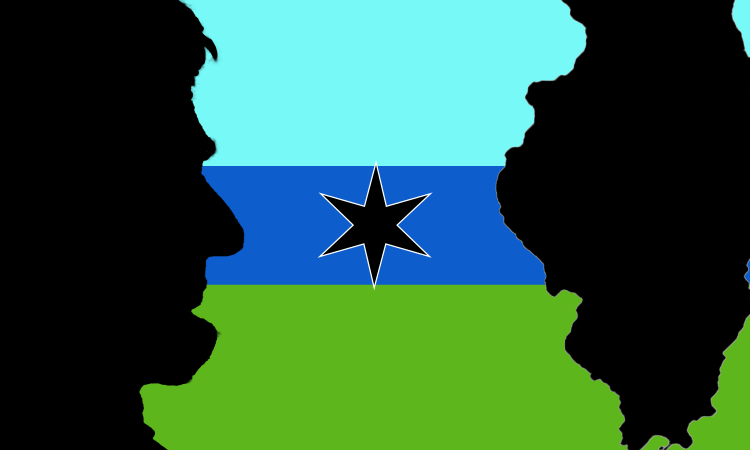
Anyway, these were the immutable characteristics of what I would incorporate into future designs: the state’s own profile (nothing looks much like Illinois as itself), some image of Lincoln, a color scheme suggestive of the prairie (with some reference to Lake Michigan and the various rivers that flow through and around the edge of the state), and the six-pointed star that Chicago has essentially made its own, as it’s something of a lynchpin of the state. Let’s face it, Illinois without Chicago is basically Iowa on the eastern side of the Mississippi, so there has to be a nod to the city that rather defines it, even as it stands apart from it. Until such time as Illinois does what Basel did, and kick it out to sink or swim as a city-state on its own (and those of us on the outside of it would expect the former, quite honestly), we might as well include the star as a distinctive part of our overall identity.
Which leads into what I decided to do with the star in my next attempt; since Illinois was the twenty-first state added to the Union, why not make a constellation of twenty-one such stars? And so, using a circle around the state (and a drawing of Lincoln in profile), here was my next draft:
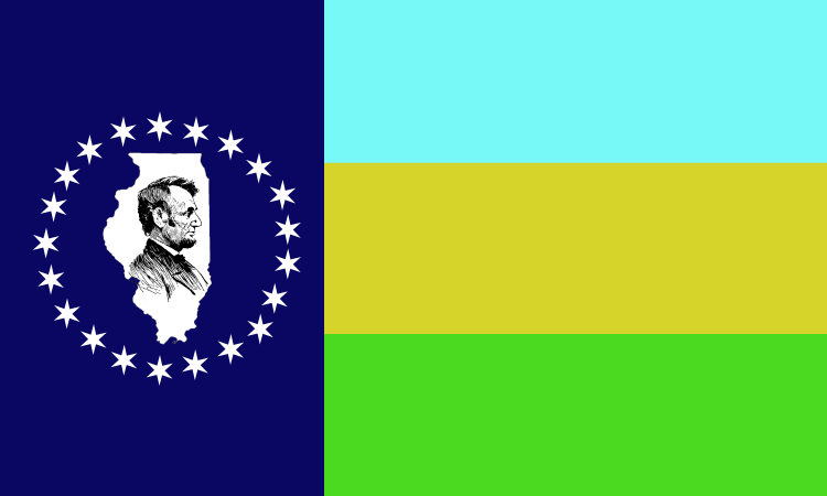
It was at this point that it occurred to me that the colors I’d chosen to represent the prairie – green for the grasses, and gold for the grains – could as easily be used to represent commerce and industry, as green has become almost synonymous with money, especially here in the States, while gold is… well, gold.
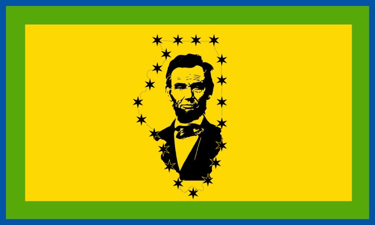
So my final try for now – because, apparently, one can only submit three designs to the Secretary of State (which is a bit of a pity, as I thought that some of these elements could be moved around or palette-swapped a bit, but I would have to forgo such attempts) – was originally going to focus on the golden crop of the prairie, as well as the profit of the city’s enterprise. The trouble is, New Mexico’s flag (a top-notch, simple design) already uses a gold field, so there’s no sense in competing with it. So I gave the final attempt a border or two:
I had thought of doing a flag with a split screen layout, with nighttime in the city (and a single six-pointed star illuminating the night) and daytime in the country (with a golden disk in the light blue sky representing the sun watching over the prairie, and a vertical bar in the middle with Lincoln looking toward the prairie sun in the fly, which could be a subtle inclusion of the letter “I” (hey, Ohio gets away with a circular buckeye initial in their flag). On the other hand, given what I’ve already said about Chicago, this might be too blatant a repudiation of the city, even if the skyline takes up nearly half of the flag in the hoist. Besides, trying to represent all that would be way too complex for a good flag; mine are already a little close to being outside of the capability of a five-year-old to recognizably draw.
In any event, after submitting these, I got confirmations back from the Secretary of State about the latter two, along with a number identifying each of them, and suggesting that not even eleven hundred have been submitted at this point, giving me just about a two percent chance of one of them getting into the top ten to be voted on, just from raw numbers. Not great, but not infinitesimal. But the first one never got a confirmation, so they may never have received it. And I think I might be okay with that, as I might be able to come up with something better. Or not; who knows?
Still, in any event, keep an eye on me – and maybe these designs, if you feel like it – and wish me luck. I’m sure I’ll need it.

